14 June 2026

Few marks in the history of visual culture have done what two interlocking Cs have managed. To signal wealth without speaking a word, to whisper restraint whilst fastened to millions of handbags. The Chanel double-C monogram is, in this sense, an extraordinary object – one whose identity has shape-shifted across a century, carrying the weight of its founder’s biography, the fantasies of its various custodians, and now, in 2026, the quietly radical intentions of a new directorial hand.
This is the story of that mark. Where it came from and where it is going.
Gabrielle Chanel was born in 1883 and deposited, at the age of twelve, into the Aubazine Abbey, an austere Cistercian orphanage in Corrèze, France. She would spend six formative years there. The nuns taught her to sew. The architecture taught her something else.
The abbey’s stained glass windows, arranged in geometric interlacing patterns of curves and counterforms, are widely cited as a probable inspiration for what would become one of the most recognizable marks ever designed. The geometry of faith, refracted through coloured light, was lodged somewhere in the young girl’s imagination until decades later, it emerged as the double C.

Aubazine Abbey
Catherine de' Medici's cypher
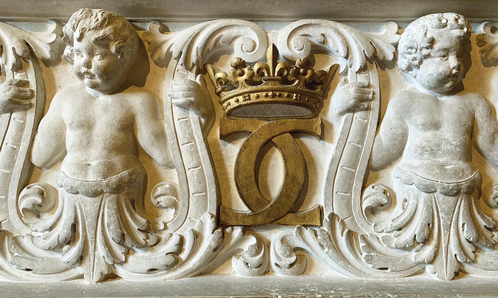
There is a second, more romantic theory. Chanel was, throughout her life, a devoted admirer of Catherine de’ Medici, Queen of France from 1519 to 1589, whose own royal cypher featured two outward-facing interlocking Cs, sometimes laced with an H for her husband, King Henry II. That Chanel would reach back through French royal history, absorbing the visual grammar of a queen she idolized, is entirely consistent with her character: she was a born mythmaker, perpetually constructing and editing her own legend.
A third possibility, and more intimate still, has it that the monogram fused not Chanel’s own initials but hers and those of Arthur “Boy” Capel, the Englishman who financed her first boutique and was, by every account, the great love of her life. Two Cs, facing each other, interlocked. A private symbol made public.
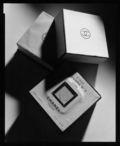
Whatever its true source, the mark was formalized in 1924, first appearing on beauty products – lipstick bullets and compacts. The logo debuted not with fanfare but with the same cool inevitability that would come to define everything Coco Chanel did. It simply appeared, fully formed.

Chanel and Arthur "Boy" Capel
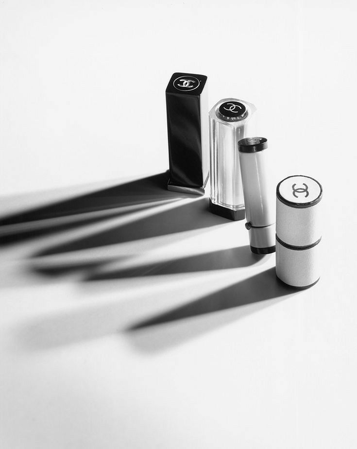
CHANEL beauty products, 1924
When Karl Lagerfeld arrived at CHANEL in 1983, the house had been largely dormant for over a decade. Gabrielle Chanel had died in 1971, and what followed was, by most accounts, a lull – well-intentioned but directionless. Lagerfeld changed everything. Not by discarding the past, but by amplifying it into spectacle.
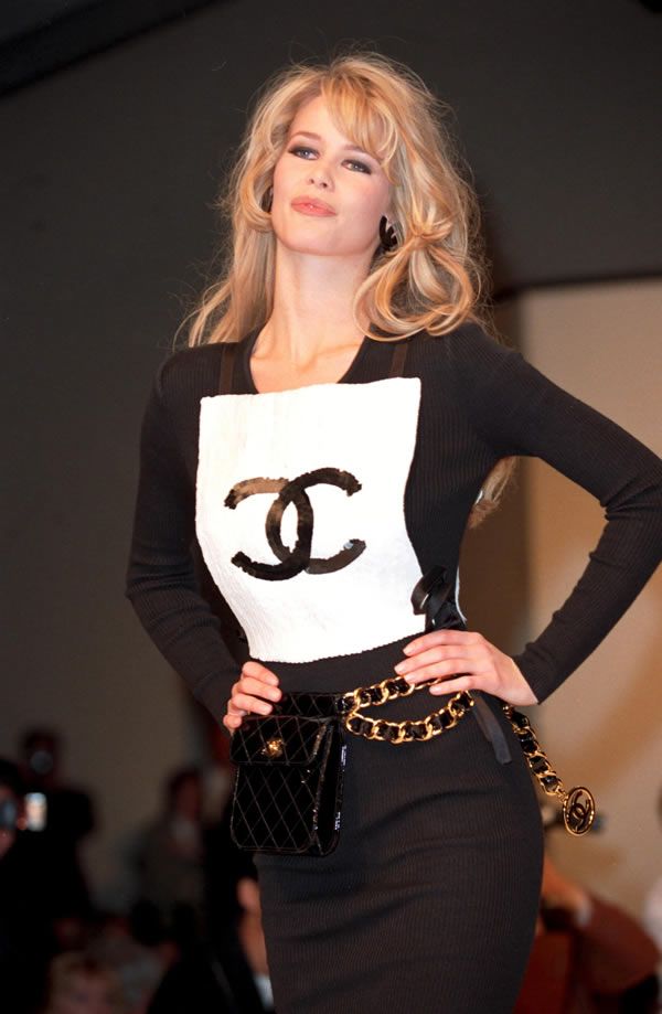
His first decisive act regarding the logo was structural. He took the original 2.55 bag – designed by Coco in February 1955, its flap secured by a simple rectangular lock – and replaced that clasp with the interlocking CC turn-lock closure. It was a gesture of bold proprietorship: the logo, previously used primarily on packaging and fragrance, was now a functioning object.
This was Lagerfeld at his most strategically brilliant. He understood that Coco Chanel had built a brand on the principle of quiet subversion: on removing ornament, on borrowing from men, on saying less. And he understood, equally, that the 1980s demanded the opposite. The double C did not contradict the CHANEL ethos; it simply played a different register of it. Chain belts adorned with the CC motif, oversized logo jewellery, and logo-emblazoned accessories became a deliberate embrace of the decade’s appetite for conspicuous branding.
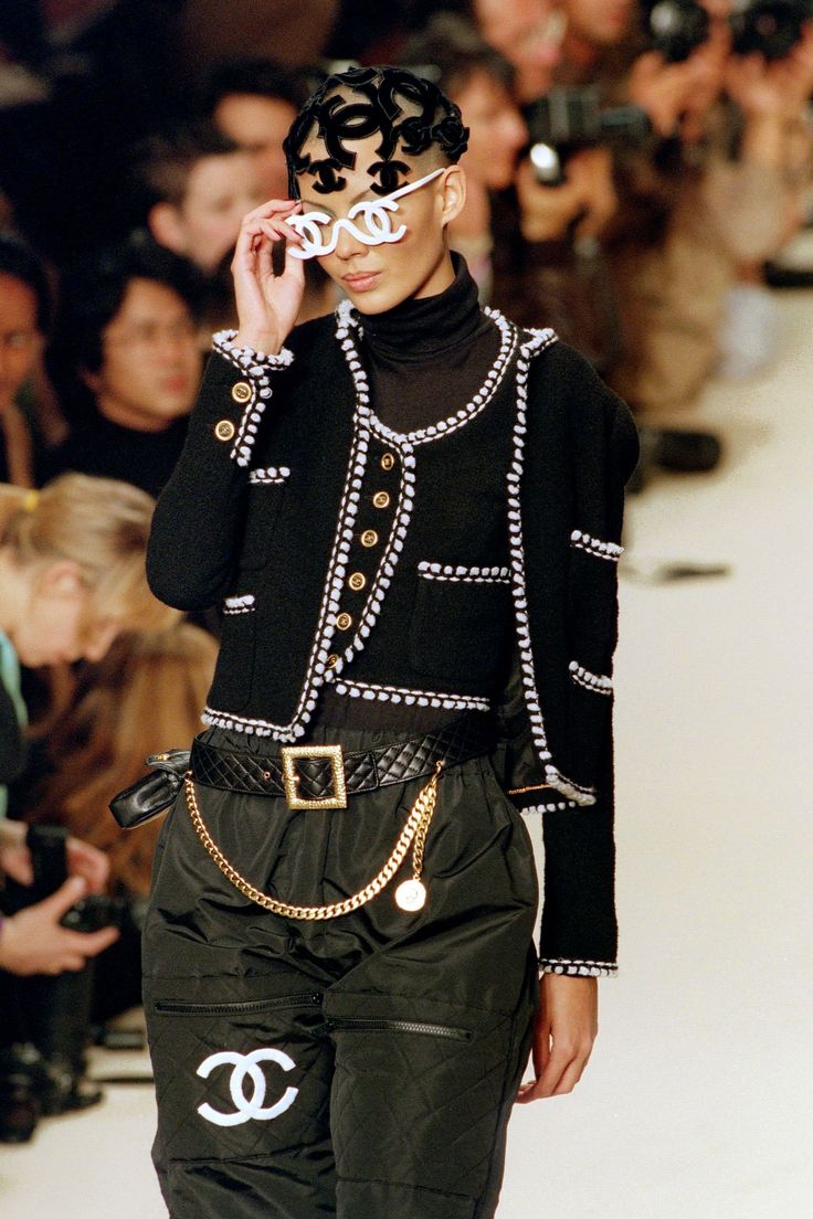
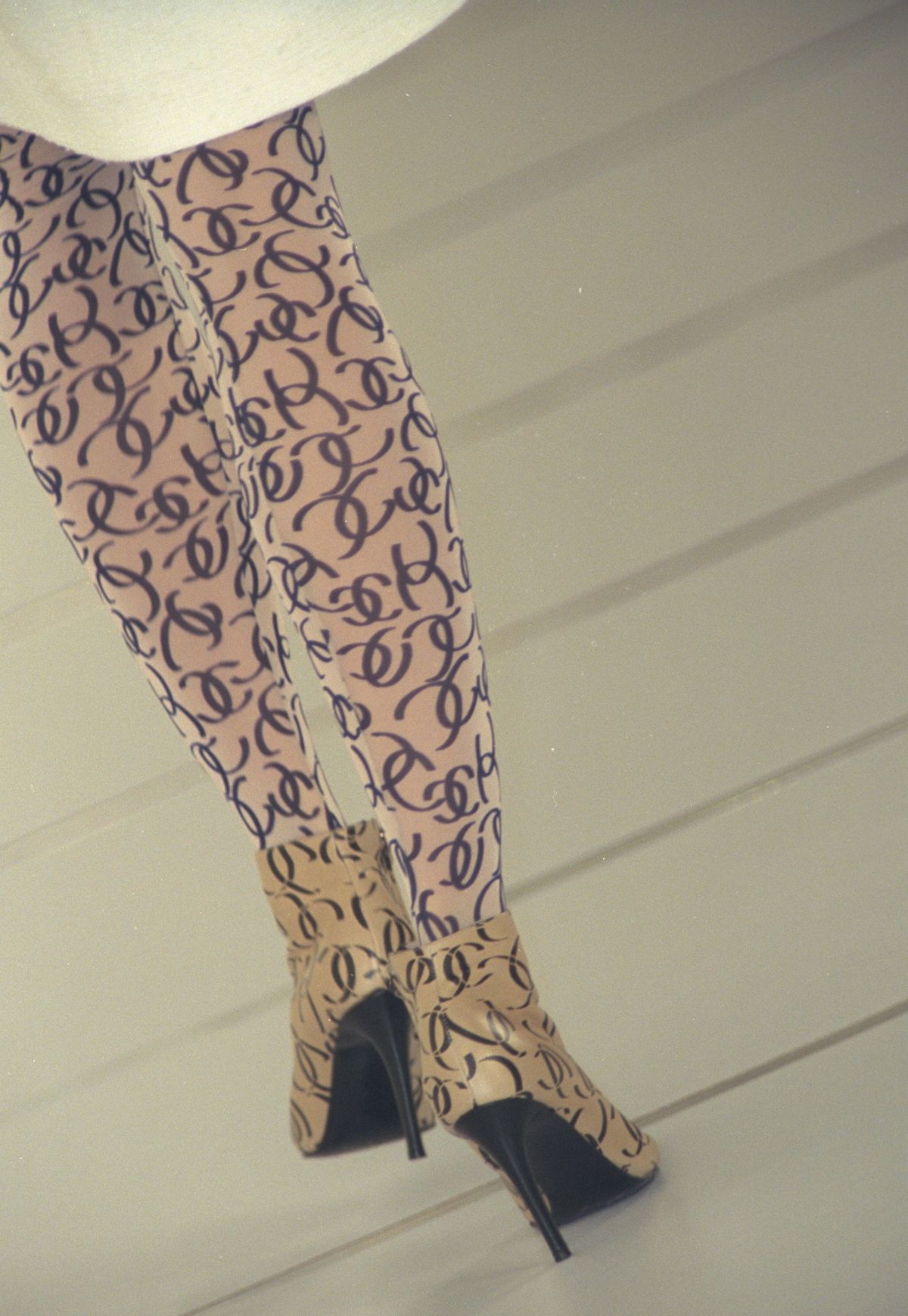
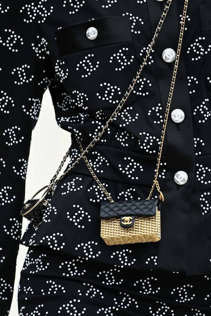
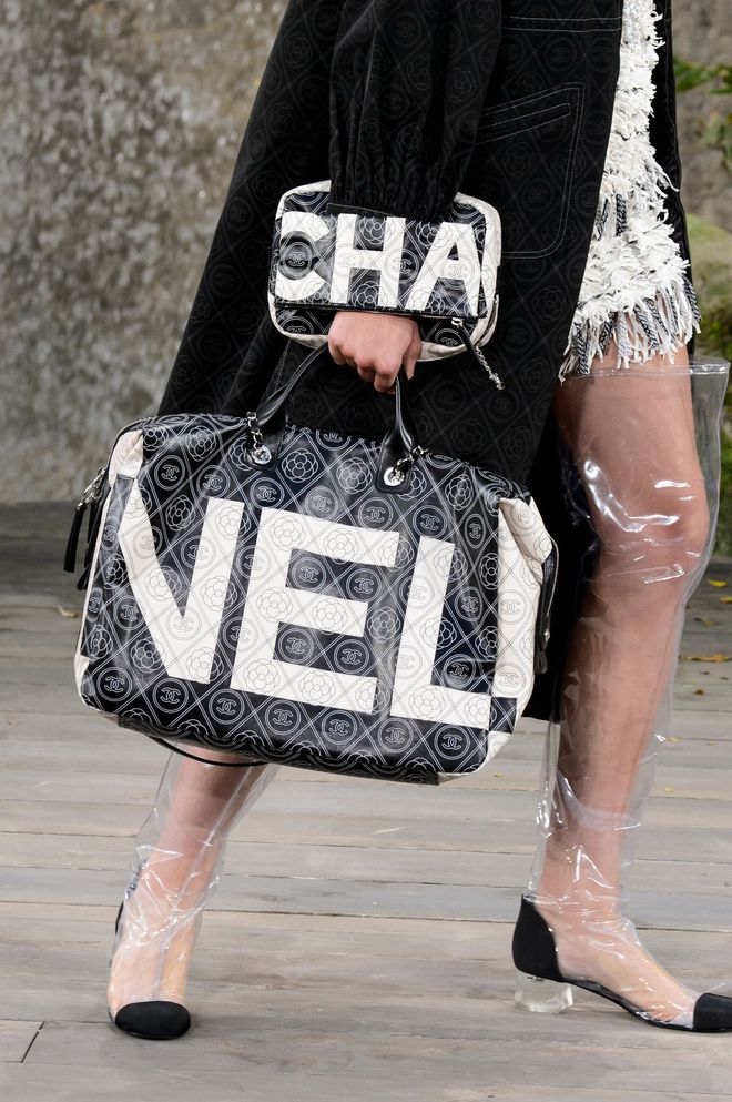
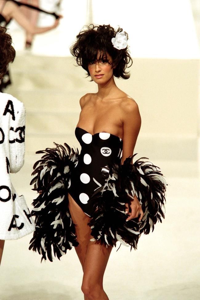
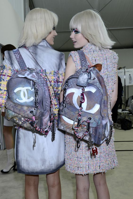
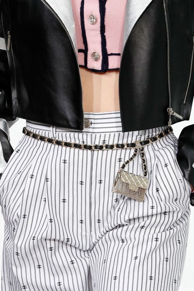
By the 1990s, the CC had become one of the defining symbols of its era – as recognizable as any corporate mark, as desired as any status signal. It appeared on everything: swimwear, thigh-high boots, belts, earrings, and brooches. It was, in the truest sense of the word, logomania: a cultural hunger for visible affiliation, for brands worn as identity. The double C did not belong only to CHANEL any longer – it belonged to culture itself. It was quoted, counterfeited, celebrated, and satirised. That is what happens to truly great marks.
Lagerfeld held this tension with genius. His CHANEL was simultaneously reverent and irreverent. The logo appeared on denim, on protest placards at his runway shows, on literal supermarket trolleys. He understood that the double C had transcended fashion and entered something broader: the iconography of modern life. To play with it was not to diminish it but to confirm its power.


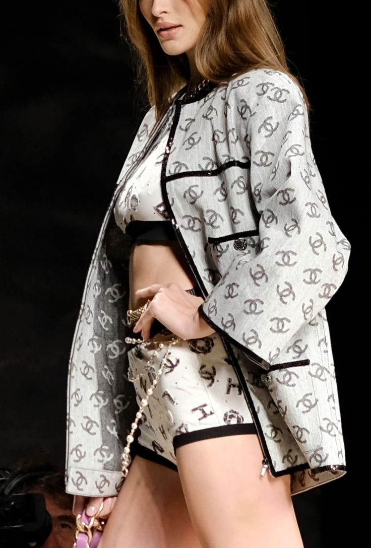
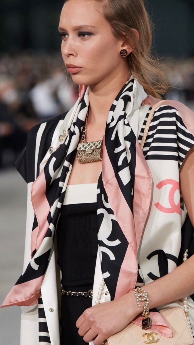
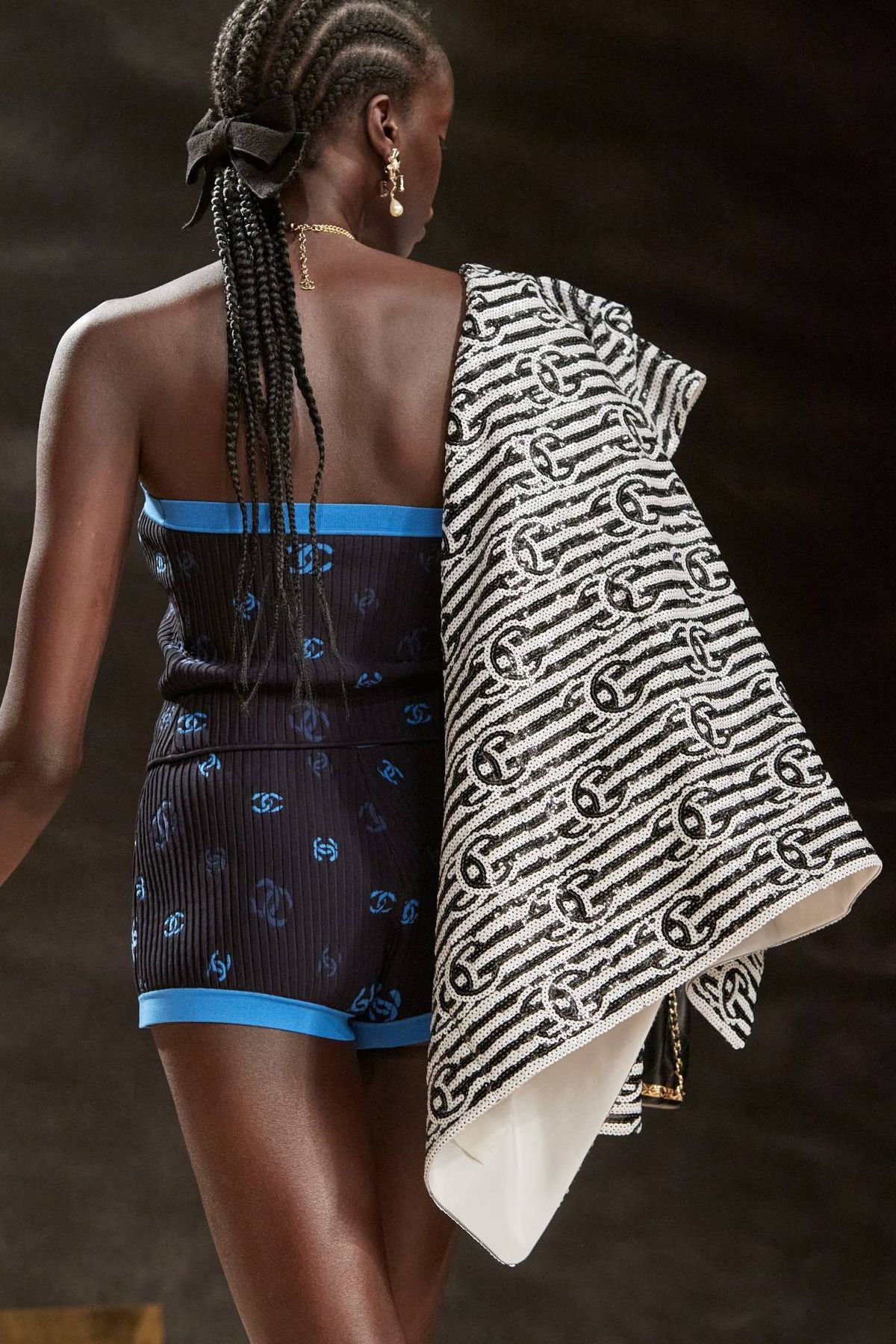
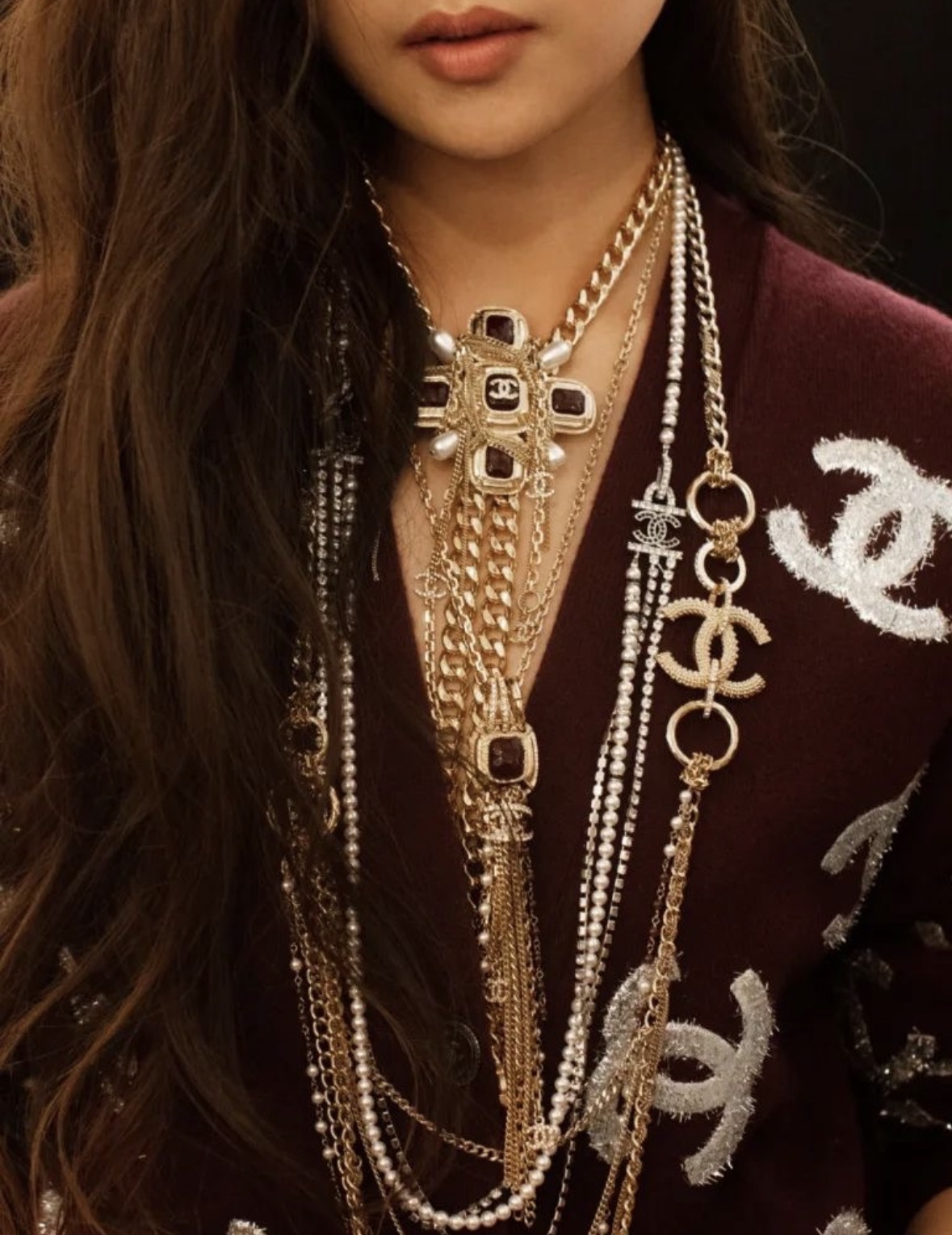
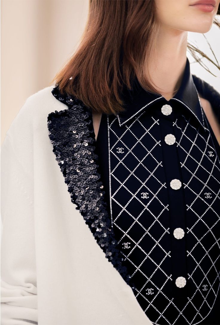
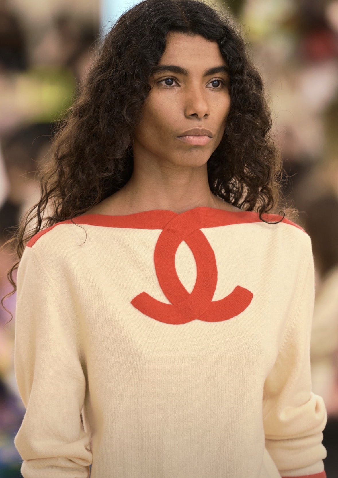
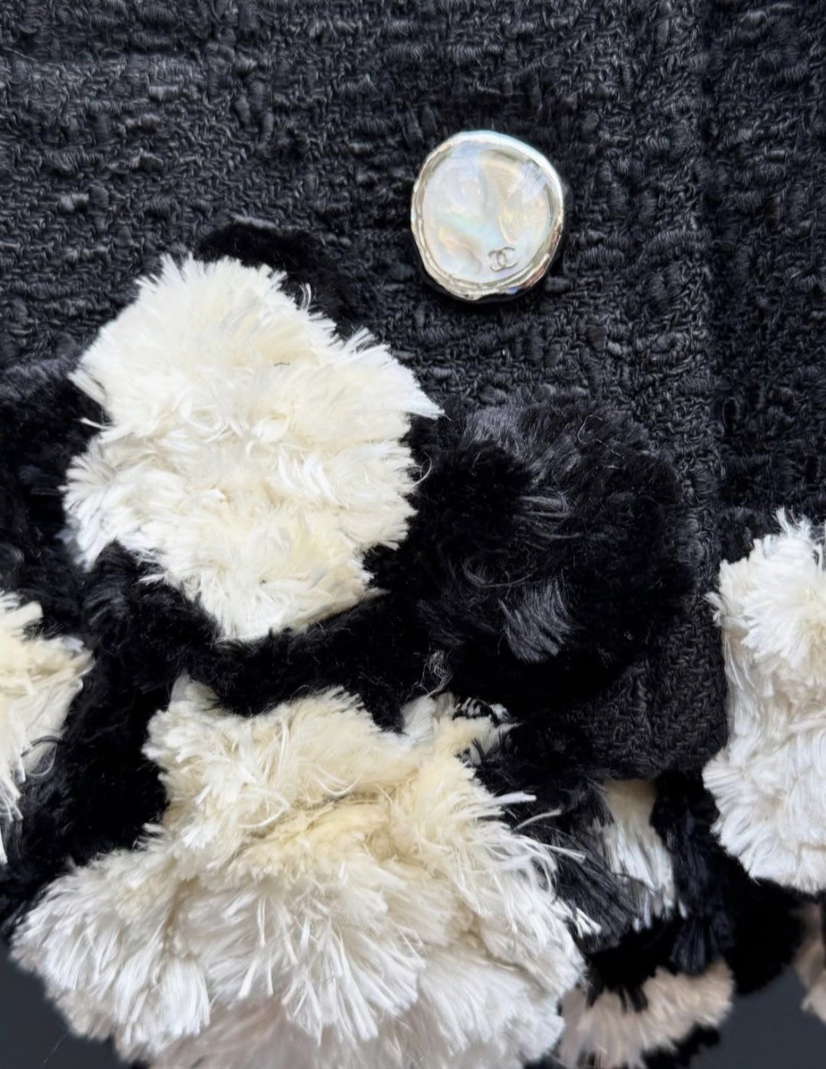
Virginie Viard’s approach to the interlocking CC logo at CHANEL was notably different from both Gabrielle Chanel’s original restraint and Karl Lagerfeld’s often theatrical use of branding. During her tenure as Creative Director from 2019 to 2024, Viard treated the logo as a house code to be integrated into clothing rather than simply displayed as a symbol of status. She frequently incorporated the double C into prints, embroidery, jewelry, buttons, footwear, knitwear, and accessories, making it a recurring visual element across her ready-to-wear collections.
One of the clearest examples appeared in the Spring/Summer 2021 collection, where Viard covered silk garments with colourful, luminous CC motifs. While the treatment felt playful and contemporary, it also referenced the graphic boldness that Karl Lagerfeld had popularized. Rather than presenting the logo as a singular hardware detail, she transformed it into an all-over decorative pattern integrated into the fabric itself.
Viard also demonstrated a strong interest in the historical origins of the emblem. Her Métiers d’Art 2020/21 collection was staged at the Château de Chenonceau, a site associated with Catherine de’ Medici and its own interlocking double-C motifs. The collection connected the logo to broader historical references, reinforcing the idea that the symbol is part of a cultural and decorative lineage rather than merely a corporate trademark.
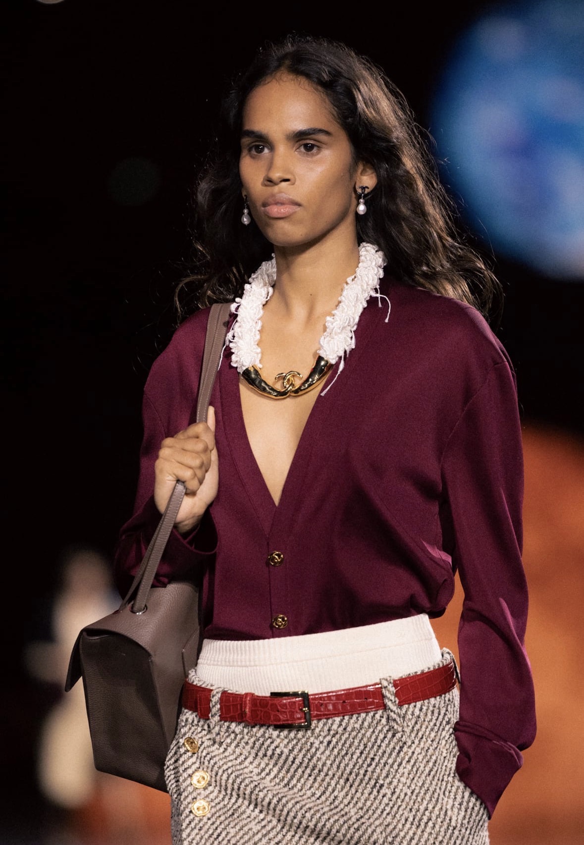
Across her collections, the CC often appeared in a softer, more feminine context than it had under Lagerfeld. Large logo earrings, crystal embellishments, oversized belt buckles, monogrammed knitwear, and prominent handbag closures became familiar elements. While Lagerfeld frequently used the logo with irony, excess, and pop-cultural energy, Viard employed it as a signifier of familiarity and continuity, aligning it with her broader focus on wearability and everyday elegance.
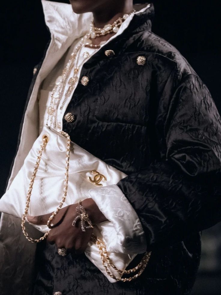
In the space between Virgine Viard’s departure and the appointment of Matthieu Blazy, the CHANEL Creation Studio designed the houses collections. While the interlocking C’s remained prominent, the usage shifted to a more discreet intention.

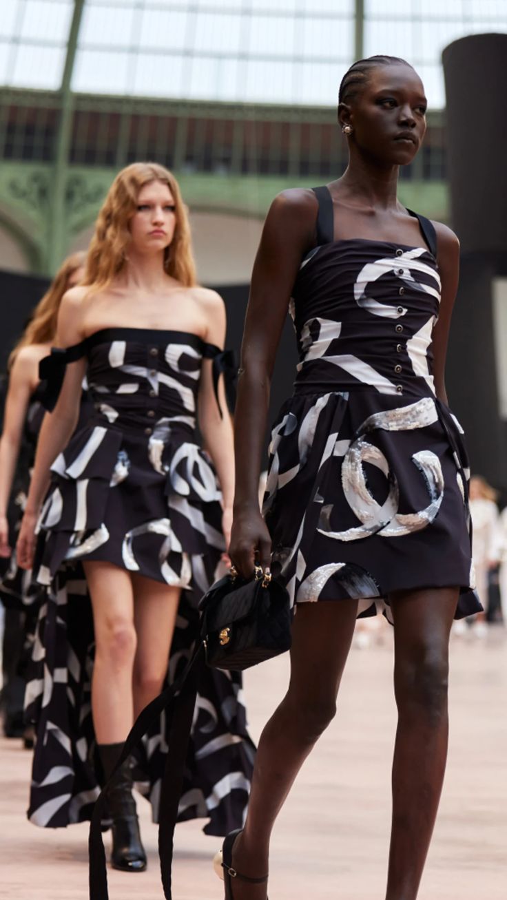
Matthieu Blazy’s debut arrived on October 6th at the Grand Palais and became the season’s most discussed moment. The collection was, by unanimous consensus, a triumph. It was also, in the context of this history, a quiet revolution in how CHANEL’s most powerful symbol was handled.
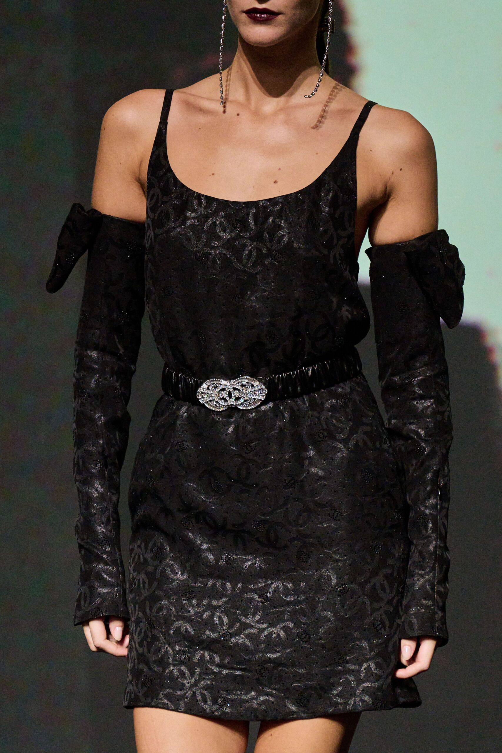
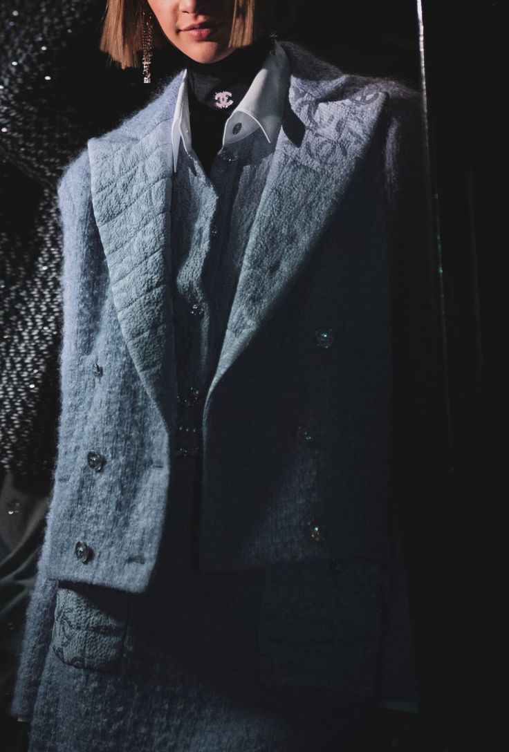
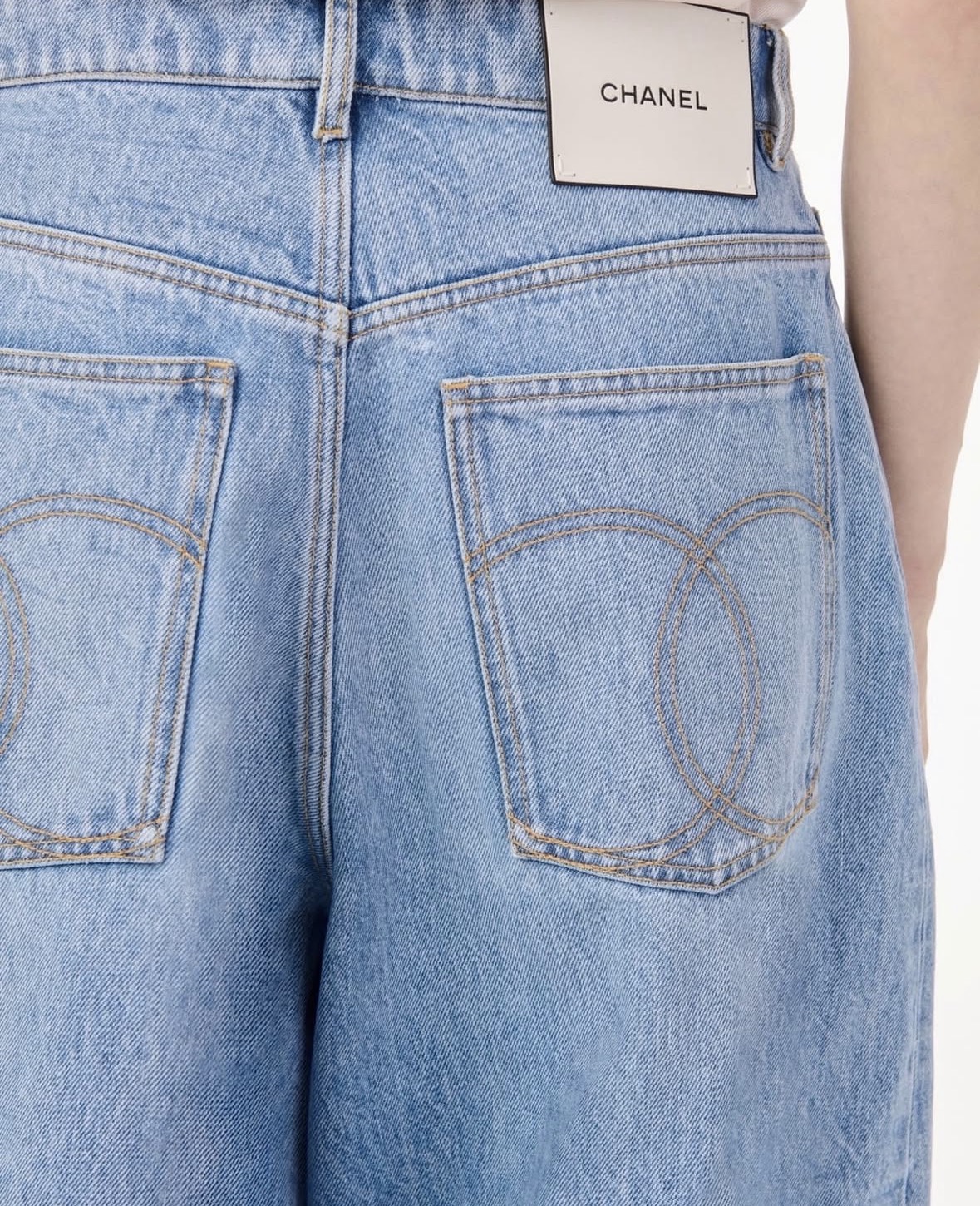
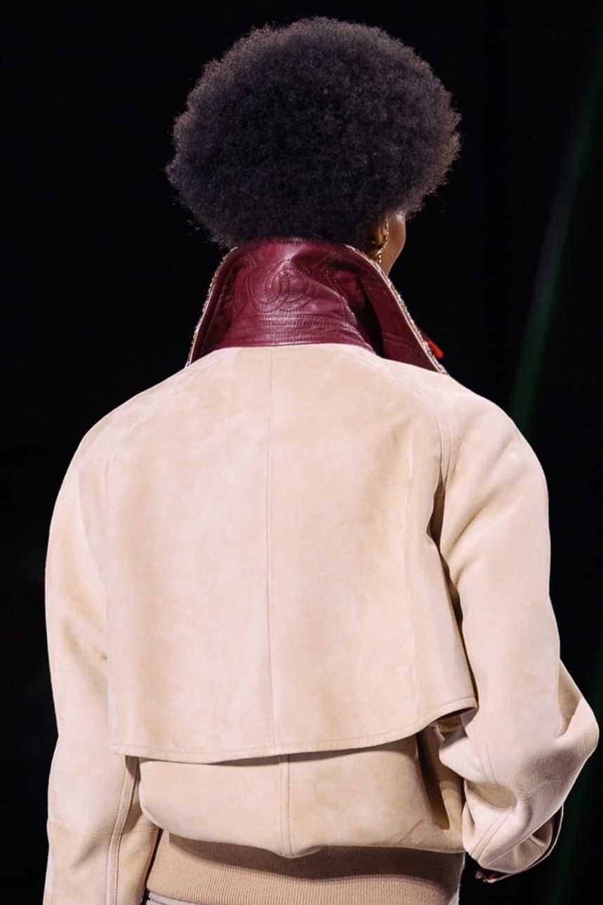
Blazy did not abandon the double C. To do so would have been an act of violence against the archive, and Blazy is too intelligent – too genuinely in love with fashion’s history – for such gestures. Instead, he did something more nuanced: he returned the monogram to the condition Coco herself had perhaps always intended. Not the banner, but the signature. Not the declaration, but the detail.
On his debut bags, the CC appears as small hardware – a miniature clasp on a softened suede tote, a subtle turnlock on an envelope shoulder bag, a tiny silver accent on a stripped-down messenger. The proportions adjusted; the surfaces sometimes entirely free of visible branding. Where the logo appears, it earns its place. It does not shout. It is discovered rather than announced.
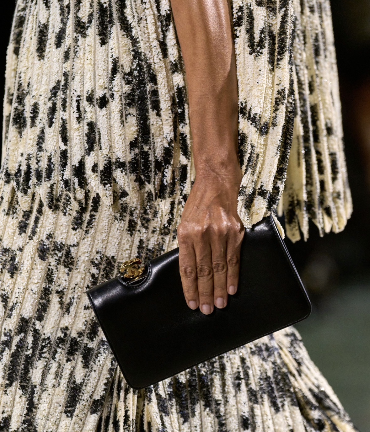
This is not logo erasure – it is logo curation. Blazy revisited the 1991 CHANEL Messenger, retaining its oversized stitched CC with full fidelity, demonstrating that he knows the archive intimately and is not afraid of it. What Blazy is articulating – in the language of accessories, of hardware, of proportion – is a theory of luxury that feels deeply current and, simultaneously, deeply original. He allows the double C to exist where it belongs while permitting the clothes, the materials, the silhouettes, to do the primary speaking.
His collections position CHANEL in what critics have called the “silent luxury” conversation, though Blazy’s silence is not minimalist in the austere sense. It is full of reference, of character, of warmth. The first look of his debut was a shirt and trousers borrowed, conceptually, from Boy Capel — from the very man who may have given the CC half of its meaning. There is an almost literary quality to the gesture: beginning at the origin, then moving forward.
The double C has survived a century because it is, at its core, a perfect thing: balanced, geometric, personal, impersonal, ancient and modern all at once. It has been worn by queens of France and queens of pop, carried down runways by supermodels and photographed on the arms of billions. It has been counterfeited more than almost any symbol in fashion history — the sincerest form of cultural relevance.
Under Blazy, it enters a new phase: not the age of logomania, nor the age of invisibility, but something more considered. The age of intention. As an invitation to look more closely — to discover the craft beneath the clasp, the history within the hardware, the story that two interlocking letters have been quietly telling for a hundred years.